Wednesday 4 April 2012

The Final Three - Execution and Craftsmanship

Tree on Fire

Visual Treatment
i) Art Movement: Cubism
ii) Reference Artist: Pablo Picasso
iii) Theme Chosen: Environmentalism
iv) Ideation and Concept: Forest destruction is the main concept of this artwork. The tree represents the forest whereas the fire represents the destruction. Trees are important to us and I hope this artwork can convey the awareness among the people to stop the destruction of forest. 

Cans

Visual Treatment
i) Art Movement: Cubism
ii) Reference Artist: Pablo Picasso
iii) Theme Chosen: Environmentalism
iv) Ideation and Concept: This artwork emphasize the recycling of cans rather than just throwing them around. 

Glass

Visual Treatment
i) Art Movement: Cubism
ii) Reference Artist: Pablo Picasso
iii) Theme Chosen: Environmentalism
iv) Ideation and Concept: This artwork emphasize the recycling of glass. 


Photoshop Process
~Tree on Fire~


- This is the original sketch.


- I used polygonal lasso tool to draw the shape of the fire so that I can fill the colour of fire. 


- Then I used gradient tool to choose the colour I wanted and filled up the selected area.


- After using the gradient tool.


- The steps were repeated for other parts of the fire.


- If I wanted to colour the branches, I just closed the layer of 'fire' and then used polygonal lasso tool to draw the shapes of the branches on a new layer.


- After filling up the colours of the branches and fire.


- There were still some pencil lines and 'holes' in the picture.


- I decided to filter the picture using 'palette knife'. (Filter>Artistic>Palette Knife)


- The pencil lines and 'holes' seem blurred out.


- But the branches appeared to stand out more than the fire. So I added the 'mosaic tiles' texture onto the picture. (Filter>Texture>Mosaic Tiles)


- After applied the 'mosaic tiles'.


- The complete artwork.

~Cans~


- The original sketch.


- Applied 'watercolor'. (Filter>Artistic>Watercolor)


- The result after applied the 'watercolor'.


- Then I added 'smudge stick'. (Filter>Artistic>Smudge Stick)


-Result after added the 'smudge stick'.


- The completed artwork.

~Glass~


- The original sketch.


- I used polygonal lasso tool to draw the shape.


- Then I used the gradient tool to choose the colour I wanted and filled up the selected area.


- I coloured the glass pieces first.


- Then I coloured the background using the same procedure.


- Using the same steps, I coloured the sides of the glass using darker colour than the colour on the front parts.


- Lastly just coloured the glass bottles.


- After filling up all the colours.


- I chose 'palette knife' again for my artwork.


- I then added 'water paper' to make my artwork brighter. (Filter>Sketch>Water Paper)


- The brighter and completed artwork.


Wednesday 29 February 2012

Sketches-Part 1

Art Movement : Cubism
Chosen theme : Environmentalism
Artist              : Pablo Picasso

Introduction
Environment is very important for human being. We depend on each other to survive. For example, trees depend on our carbon dioxide to survive and we depend on their oxygen to survive. Imagine the world without grass, tress and animals, people will be living in a dull and boring place. Besides that, we might not even live in this world without their oxygen.

Problem Statement
I choose environmentalism because nowadays I see a lot of pollution everywhere. With more waste, it is like filling our house with more rubbish. The environment is our second home. Therefore, I think it is important for us as human being to conserve the environment.

Purpose of Content
Through my drawings, I hope the people will reduce, reuse and recycle to minimize the impact of pollution. I also hope that people can see the consequences of pollution.

Research Question
How do we protect the environment and what are the consequences if we don't do so?

Girl Protecting the Earth
A girl is holding the earth, whole picture represents protecting the earth from destruction or any other pollution. 
Beautiful World
An environment without pollution or any other destruction will be full of joy and happiness. 
Save the Earth
The cube represents the earth. The earth needs injection, signifies that the earth is "sick" as a result of human behaviour and needs to be saved. 
Flower and Butterfly
Again, the environment without pollution will be full of beautiful creatures.
Glass
Represents the recycling of glass or glass bottles.
Tree on Fire
Giant tree represents forest, the picture is talking about forest destruction.

Elements of Design Analysis
Lines: Curve and interchanging lines.
Colours: Mostly bright colours are used.
Values: Strong contrast between the bright fire and the dark coloured tree.
Texture: Smooth.
Shape: Square, triangle, rectangle, quadrilateral and all types of shapes, hand free.
Proportion: Figures are stretched, contorted and twisted.

Principles of Design Analysis
Balance: Asymmetrical.
Rhythm and Movement: Fire gives this picture the appearance of movement.
Repetition: Shapes and colours.
Scale: Real.
Unity: Appears to be unified. 
Garbage World
If we don't take care of the environment, the earth will be full of garbage. Square background represents garbage, a man is surrounded by garbage.
Cans
Recycling of cans.

Elements of Design Analysis
Lines: Straight, vertical, horizontal, curve, interchanging.
Colours: Black and white.
Values: Mild contrast between the cans and the background.
Texture: Smooth.
Shape: Geometric and rectangle.
Proportion: Figures are stretched, contorted and twisted.


Principles of Design Analysis
Balance: Asymmetrical.
Repetition: Shapes.
Scale: Real.
Unity: Unity in shapes and shades.
Water and Plants
If there is water, plants will grow. Emphasize conservation of water.

Elements of Design Analysis
Lines: Straight, horizontal, vertical, curve, interchanging.
Colours: Light colurs are used.
Values: Use of light colours give a mild contrast.
Texture: Smotth.
Shape: Square, rectangle, round.

Principles of Design Analysis
Balance: Asymmetrical.
Repetition: Shapes and colours.
Scale: Some squares are small and some are big. Water appears to be bigger than plants.
Unity: In colours and shapes.
Air Pollution
Factories produce smoke that causes air pollution.
Oil Leaking
Colourful squares represent oil leaked by the ship, which contributes to water or sea pollution that could harm many species that survive under the sea.


Sunday 29 January 2012

Cubism

The Weeping Woman by Pablo Picasso

Cubism was invented around 1907 in Paris by Pablo Picasso and Georges Braque. It was the first abstract style of modern art which evolved at the beginning of the 20th century. In Cubist artworks, objects are broken up, analyzed, and re-assembled in an abstracted form. Instead of depicting objects from one viewpoint, the artist depicts the subject from a multitude of viewpoints to represent the subject in a greater context. A typical Cubist painting depicts real people, places or objects. It will show you many parts of the subject at one time, viewed from different angles, and reconstructed in a composition of planes, forms, and colours.

Brief History of Cubism
In the four decades from 1870-1910, western society witnessed more technological progress than in the previous four centuries. During this period inventions such as photography, cinematography, sound recording, the telephone, the motor car and the airplane became more and more popular. Photography had begun to replace painting as the the tool to documenting the age and artists needed a more radical approach, a 'new way of seeing' that expanded the possibilities of art in the same way that technology was extending the boundaries of communication and travel. This new way of seeing was called Cubism. The Cubists was influenced by art from other cultures, especially African masks. Below is one of the artworks of Pablo Picasso that was influenced by the African masks.
 
Left: Head of a Woman, Right: Dan Mask
Cubism had two distinct phases. The early phase which lasted until about 1912 (pre 1912) was called Analytical Cubism. Here the artist analyzed the subject from many different viewpoints and reconstructed it within a geometric framework, the overall effect of which was to create an image that evoked a sense of the subject. These fragmented images were unified by the use of a subdued and limited palette of colours.

Violin and Jug by Georges Braque


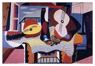
Synthetic Cubism (post 1912) was influenced by the introduction of of bold and simple collage shapes. It moved away from the unified monochrome surfaces of Analytic Cubism to a more direct, colourful and decorative style.

Still Life with Mandolin and Guitar by Pablo Picasso

Artist of Cubism
One of the greatest and most influential artists of the 20th century is Pablo Picasso, who was born in Spain (1881-1973) and is best known for co-founding the Cubist movement, the invention of constructed sculpture, the co-invention of collage, and for the wide variety of styles that he helped develop and explore. He was a painter, draughtsman, and sculptor.

Girl on a Pillow by Pablo Picasso

Elements of Design
Lines: Interchanging lines
Colours: Wide range of colours were used from dark colours to light colours such as dark blue and black to light blue and yellow.
Values: Light and dark colours give a mild contrast.
Texture: Smooth (visual texture).
Shape: Geometric and hand free.
Proportion: The figures are stretched, contorted and twisted.

Principles of Design
Balance: The images and shapes span the entire surface.
Rhythm and Movement: The angles of the head and reaching arms in Picasso's artwork seem to give the figures the appearance of movement.
Emphasis and Variety: No one area seems to be emphasized more than another.This piece definitely uses several elements of design such as lines, colours, shapes and others.
Harmony and Unity: The uniquely drawn figures give this piece a sense of visual harmony and appears to be unified.